The Ultimate Guide to Using Bold Fonts in Design: Best Practices and Examples #BoldFonts #GraphicDesign #DesignTips #VisualHierarchy #Typography #VisualDesign
Day22 - AR1 "Learn how to effectively use bold fonts to make your designs stand out and grab your audience's attention"

Bold fonts are a popular design choice that can make your text stand out and grab your audience's attention. They are widely used in various design projects, including websites, posters, advertisements, and more. In this article, we will explore everything you need to know about bold fonts, including what they are, how to use them effectively, and the best practices for incorporating them into your designs.
What are Bold Fonts?
Bold fonts, as the name suggests, are typefaces that are thicker and darker than their regular counterparts. They are often used to highlight important information or to create a visual hierarchy in a design. Bold fonts come in various styles and can be used for different purposes, such as headlines, titles, subheadings, and body text.
Why Use Bold Fonts?
Bold fonts can make your text more eye-catching and help it stand out from other elements on the page. They can also help you create a visual hierarchy in your design, where the most important information is emphasized and draws the viewer's attention. Bold fonts are versatile and can be used in a wide range of design projects, from minimalist and modern to bold and expressive.
How to Choose the Right Bold Font?
Choosing the right bold font is critical to the success of your design. Here are some factors to consider when selecting a bold font:
Purpose: What is the purpose of your text? Is it a headline, subheading, or body text? Depending on the purpose, you may need a different style of bold font.
Style: Bold fonts come in various styles, such as serif, sans-serif, slab-serif, script, and display. Each style has its unique personality and can evoke different emotions.
Readability: Make sure your bold font is easy to read, even at smaller sizes. Avoid overly decorative or ornate fonts that can be difficult to read.
Compatibility: Consider the compatibility of your bold font with other fonts used in your design. Choose a font that complements your other design elements and creates a harmonious overall look.
Branding: If you are designing for a brand, consider using a bold font that reflects the brand's personality and values.
Best Practices for Using Bold Fonts
Now that you have selected the right bold font, here are some best practices for using them effectively in your designs:
Emphasize Key Information: Use bold fonts to highlight important information and draw the viewer's attention to it. This can be a headline, a call to action, or a key message.
Create Contrast: Use bold fonts to create contrast and visual interest in your design. Combine bold and regular fonts to create a hierarchy and guide the viewer's eye through the design.
Avoid Overuse: Use bold fonts sparingly and strategically. Overuse of bold fonts can make your design appear cluttered and overwhelming.
Use White Space: Use ample white space around your bold text to help it stand out and prevent it from blending in with other elements on the page.
Consider Accessibility: Make sure your bold font is accessible to all viewers, including those with visual impairments. Choose a font that is easy to read and meets accessibility guidelines.
Examples of Effective Use of Bold Fonts
Here are some examples of effective use of bold fonts in design:
Nike: Nike's logo is a great example of the effective use of the bold font. The bold and simple design of the "swoosh" is instantly recognizable and evokes a sense of motion and energy.
Apple: Apple's marketing materials often use bold fonts to emphasize key messages and create contrast. The use of bold fonts helps to create a modern and sleek look that reflects the brand's identity.
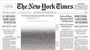
The New York Times: The New York Times is known for its bold and impactful headlines, which use a combination of bold and regular fonts to create contrast and guide the reader's eye through the article.
Airbnb: Airbnb's website uses a bold and modern sans-serif font for its headings, which helps to create a sense of sophistication and elegance.
Conclusion
Bold fonts are a versatile design tool that can help you create impact and emphasize important information in your designs. By following the best practices outlined in this article and choosing the right bold font for your purpose, you can create visually appealing and effective designs that engage your audience. Remember to use bold fonts strategically and sparingly, and to consider accessibility and readability when selecting your font. With these tips, you can create bold and impactful designs that grab your audience's attention and communicate your message effectively.