The Ultimate Guide to Typography in Design: Tips and Examples for Effective Visual Communication
Day 21- AR2 "A comprehensive tutorial on typography principles, techniques, and best practices for creating visually engaging designs that effectively communicate information."
Typography is a fundamental aspect of design that can make or break the effectiveness of visual communication. Typography refers to the art and technique of arranging typefaces to make written language legible, readable, and appealing when displayed. In today's digital age, typography has become more critical than ever, as it plays a crucial role in user experience and engagement.
In this tutorial, we will explore the key principles and techniques of typography in design, including font selection, hierarchy, spacing, alignment, and more. We will also provide examples of effective typography in design to help you understand how to apply these principles to your own projects. Whether you're a beginner or an experienced designer, this guide will help you create visually engaging designs that effectively communicate information to your audience.
Section 1: Fundamentals of Typography in Design
1.1 Font Selection:
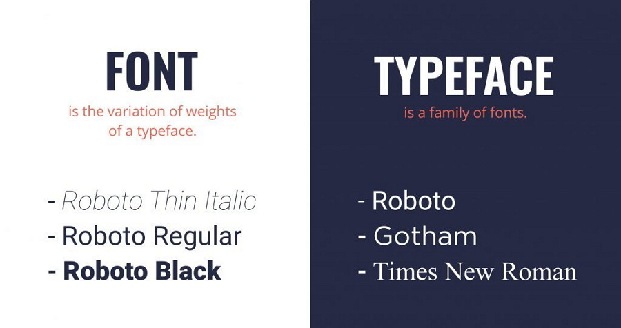
Font selection is one of the most critical aspects of typography in design. Fonts can convey different tones, moods, and emotions, so it's essential to choose the right font for the purpose of your design. When selecting a font, consider the following factors:
Tone and personality: Does the font convey the intended tone and personality of the design? Is it formal, casual, playful, or serious?
Legibility and readability: Is the font legible and readable at various sizes and distances? Is it easy to distinguish between characters and letters?
Compatibility: Does the font work well with other design elements, such as colors, images, and graphics?
Appropriateness: Is the font appropriate for the context and purpose of the design?
Here are some popular font categories and their characteristics:
Serif fonts: These fonts have small lines or flourish at the ends of letters. They are often associated with tradition, formality, and authority. Examples include Times New Roman, Georgia, and Baskerville.
Sans-serif fonts: These fonts do not have small lines or flourish at the ends of letters. They are often associated with modernity, simplicity, and clarity. Examples include Helvetica, Arial, and Open Sans.
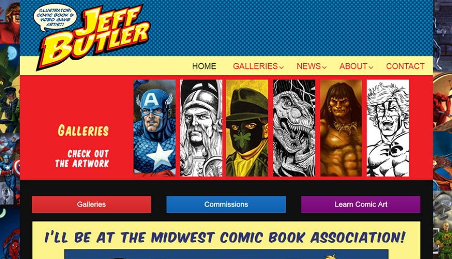
Display fonts: These fonts are decorative and often used for headlines or titles. They are designed to be eye-catching and attention-grabbing. Examples include Comic Sans, Brush Script, and Lobster.
Script fonts: These fonts mimic handwriting or calligraphy and are often associated with elegance, femininity, or romance. Examples include Edwardian Script, Lucida Calligraphy, and Zapfino.
Monospaced fonts: These fonts have fixed-width characters, where each character takes up the same amount of space. They are often used in programming or coding contexts. Examples include Courier, Consolas, and Andale Mono.
1.2 Hierarchy:
Hierarchy refers to the organization of text in a design to convey importance and emphasis. By using different font sizes, weights, colors, and styles, you can create a sense of hierarchy that guides the reader's eye through the content. Here are some tips for creating an effective hierarchy:
Use a large font size for headlines or titles to grab the reader's attention.
Use a smaller font size for the body text to make it easier to read.
Use a bold font weight or a different color for important information or keywords.
Use italic or underline styles for emphasis or to create contrast.
Use all caps sparingly, as it can be difficult to read in large blocks of text.
1.3 Spacing and Alignment:
Spacing and alignment refer to the way that text is positioned about other design elements. Proper spacing and alignment can make a design look more professional and polished. Here are some tips for effective spacing and alignment:
Use consistent spacing between lines and paragraphs to improve readability.
Use generous margins to create white space and give the design room to breathe.
Use alignment to create visual order and balance in the design. Aligning text to a grid or using left center, or right alignment can help create a cohesive look.
Section 2: Advanced Techniques in Typography
2.1 Kerning and Tracking:
Kerning and tracking refer to the spacing between individual letters and groups of letters. Adjusting the spacing can help improve legibility, readability, and visual appeal. Here are some tips for using kerning and tracking:
Adjust the kerning of specific letter pairs to improve legibility, such as the combination of "AV" or "WA."
Use tracking to adjust the spacing of all the letters in a word or line to improve readability and visual appeal.
2.2 Contrast:
Contrast refers to the difference in visual properties, such as font size, weight, color, and style, between different design elements. Using contrast can help create visual interest and draw attention to specific information. Here are some tips for using contrast:
Use a large font size or bold weight for headlines to create contrast with body text.
Use contrasting colors, such as light text on a dark background or vice versa, to draw attention to specific information.
Use contrasting font styles, such as a serif font for headlines and a sans-serif font for body text, to create visual interest and hierarchy.
2.3 Texture and Effects:
Texture and effects refer to the visual properties of the font itself, such as texture, shadow, or gradient. Using these properties can help create a unique and memorable design. Here are some tips for using texture and effects:
Use textured fonts, such as handwritten or brush fonts, to add personality and uniqueness to a design.
Use shadow or bevel effects to create a 3D effect or to create contrast with the background.
Use gradient effects to add visual interest and depth to a design.
Section 3: Examples of Effective Typography in Design
To help you better understand how to apply the principles and techniques of typography in design, here are some examples of effective typography in different design contexts:
3.1 Website Design:
Effective typography is crucial for website design, as it can greatly impact user experience and engagement. Here are some examples of effective typography in website design:
Airbnb uses a sans-serif font with generous spacing and alignment to create a clean and modern look.
The New York Times uses a serif font with a strong hierarchy and contrast to create a traditional and authoritative look.
Dropbox uses a playful and unique display font to add personality and brand identity to its design.
3.2 Print Design:
Typography is also essential for print design, such as brochures, posters, and flyers. Here are some examples of effective typography in print design:
The Metropolitan Museum of Art uses a serif font with a classic and elegant look for its exhibition brochure.
Nike uses a bold and impactful sans-serif font with strong contrast and hierarchy for their advertisement posters.
The New Yorker uses a unique and recognizable display font for their magazine covers, adding personality and brand identity to their design.
Conclusion:
Typography is a crucial aspect of design that can greatly impact the effectiveness of visual communication. By understanding the principles and techniques of typography, such as font selection, hierarchy, spacing, and alignment, designers can create visually engaging designs that effectively communicate information. By using examples of effective typography in different design contexts, designers can better understand how to apply these principles to their own projects. With these tips and examples, you can create designs that effectively engage and communicate with your audience.


