

The Complete Guide to Typography for Diagrams: Tips and Tricks for Creating Visually Engaging Content
Day 21 - AR1 "A Comprehensive Tutorial on How to Effectively Use Typography in Diagrams and Visualizations"

Typography is an essential aspect of creating visually appealing diagrams and visualizations. It can be challenging to get the right balance of font size, style, and color that complements the overall design of the diagram. However, with the right tips and tricks, it is possible to create visually engaging diagrams that convey information effectively. In this tutorial, we will explore the various aspects of typography and how to use it effectively in diagrams and visualizations.
Section 1: Understanding Typography in Diagrams
Typography is the art and technique of arranging type to make written language legible, readable, and appealing when displayed. It includes font selection, size, spacing, alignment, and color. In diagrams and visualizations, typography plays a crucial role in communicating information clearly and effectively.
To understand typography in diagrams, it is essential to consider the following aspects:
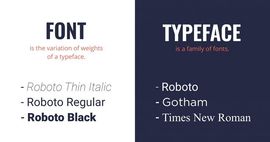
1.1 Font Selection:
The font you choose should reflect the tone and purpose of the diagram. For instance, if the diagram is for an academic presentation, a formal font like Times New Roman or Georgia might be appropriate. On the other hand, if the diagram is for a more informal setting, a more casual font like Arial or Verdana might be a better choice.

1.2 Font Size:
The font size should be large enough to read comfortably, but not so large that it takes up too much space in the diagram. It is important to strike the right balance between readability and space usage.
1.3 Spacing:
Proper spacing between letters, words, and lines makes the text easier to read. Adequate spacing ensures that the text does not appear cramped or cluttered.
1.4 Alignment:
Alignment refers to the position of the text relative to the surrounding elements in the diagram. Proper alignment can create a sense of balance and harmony, while poor alignment can make the diagram look cluttered and confusing.
1.5 Color:
The color of the text should complement the overall design of the diagram. It is essential to choose colors that are easy to read and do not clash with the other elements in the diagram.

Section 2: Tips and Tricks for Effective Typography in Diagrams
Now that we understand the basics of typography in diagrams, let's explore some tips and tricks for creating visually appealing diagrams.
2.1 Use Hierarchy:
Hierarchy refers to the organization of information in order of importance. Using hierarchy in typography can help convey information more effectively. For example, using larger font sizes for headings and subheadings and smaller font sizes for supporting text can help readers understand the relationship between different elements in the diagram.
2.2 Use Consistency:
Consistency in typography creates a sense of harmony and unity in the diagram. It is important to use the same font, size, spacing, alignment, and color throughout the diagram. Consistency can make the diagram look more professional and polished.
2.3 Use Contrast:
The contrast in typography can create visual interest and draw attention to important information in the diagram. For example, using bold or italicized text for headings or key phrases can help them stand out from the rest of the text.
2.4 Use White Space:
White space refers to the areas of the diagram that are left blank. Using white space effectively can help create a sense of balance and harmony in the diagram. It can also make the text easier to read by preventing the text from appearing cluttered or cramped.

2.5 Use Simple Fonts:
Simple fonts are easy to read and understand. They are also more accessible to a wider audience, including those with visual impairments. Using overly decorative or complex fonts can make the text difficult to read and distract from the overall design of the diagram.
2.6 Use Text Boxes:
Text boxes can help create a clear separation between different sections of the diagram. They can also help draw attention to important information by framing it in a box. Text boxes can be used to highlight key points or to provide additional context to the information in the diagram.
2.7 Use Bullet Points:
Bullet points can help break up large blocks of text and make the information more digestible. They can also help draw attention to important points and create a sense of hierarchy in the information.
Section 3: Examples of Effective Typography in Diagrams
To further illustrate the concepts discussed in this tutorial, let's look at some examples of effective typography in diagrams.
3.1 Flowchart Example:
In this flowchart example, the font size is large enough to read comfortably, and the spacing between elements is consistent throughout the diagram. The font is simple and easy to read, and the use of bold text draws attention to important information. The use of white space makes the diagram appear less cluttered and more visually appealing.

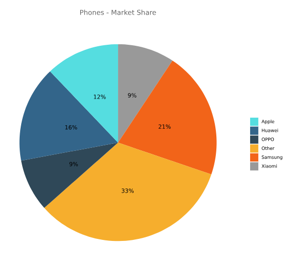
3.2 Pie Chart Example:
In this pie chart example, the font size and spacing are consistent throughout the diagram. The use of contrasting colors helps draw attention to the different sections of the chart. The font is simple and easy to read, and the use of white space helps create a sense of balance and harmony in the diagram.
Conclusion:
In conclusion, typography is an essential aspect of creating visually engaging diagrams and visualizations. By understanding the basics of typography and using the tips and tricks discussed in this tutorial, it is possible to create diagrams that effectively communicate information and engage the audience. Remember to choose fonts that reflect the tone and purpose of the diagram, use hierarchy and consistency to organize information, and use white space and contrast to create a visually appealing design. With these techniques, you can take your diagrams to the next level and create content that truly stands out.